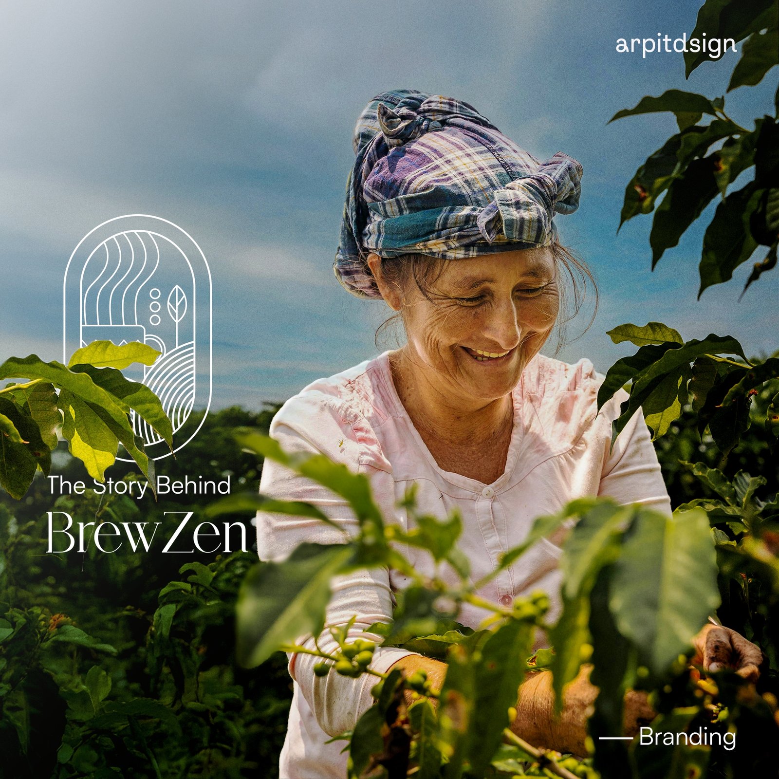
BrewZen
What I did
Industry
Coffee Brand
Description
When I started working on BrewZen’s branding, I wanted to craft something that truly resonated with their vision—a brand that blends the natural essence of tea farming with a modern, calming aesthetic. Every element in this project, from the logo to the typography and colors, reflects the mindfulness and purity that BrewZen embodies.
The logo was designed to symbolize harmony and nature, while the color palette combines earthy greens and warm golden tones to evoke a sense of tranquility and luxury. The typeface pairing of Glycerints and Satoshi was chosen to maintain elegance and clarity across all applications.
This project was not just about creating visuals—it was about telling a story that connects deeply with BrewZen’s audience. I’m proud to have created a brand identity that feels authentic, timeless, and aligned with their values.